- February 28, 2023
Nokia reimagines its iconic logo to demonstrate to the world that it is no longer a phone company
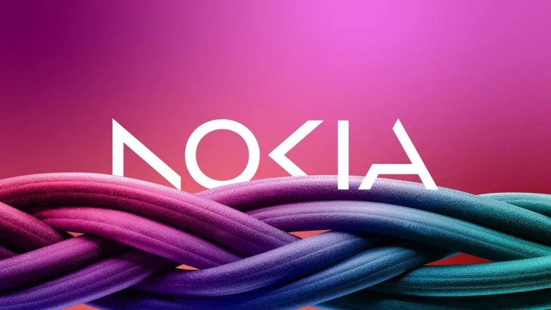
In an effort to distance itself from its public image as a phone company, Nokia redesigned its logo for the first time in decades.
On Sunday, the new logo, which was unveiled, combines five distinct shapes to spell NOKIA. The font is more modern, and the standard shade of blue that is associated with the brand has been replaced by a variety of colors that can be placed in any order.
CEO Pekka Lundmark wrote in a Sunday press release, “We built on the heritage of the previous logo, but made it feel more contemporary and digital, to reflect our current identity.”
Nokia struggled to compete with Apple, Samsung, and others in the smartphone market after becoming the largest cellphone manufacturer and a symbol of the flip phone era. In a disastrous 2014 deal, Nokia sold its mobile phone business to Microsoft. The next year, Microsoft had to write off $8.4 billion.
While concentrating on mobile and cloud networking technologies, the company has struggled to shed its image as a phone company since then. With plans to expand its presence in the enterprise market, Nokia currently generates the majority of its revenue from sales to businesses.
“To signal this ambition we are refreshing our brand to reflect who we are today – a B2B technology innovation leader,” Lundmark said. “This is Nokia, but not as the world has seen us before.”
The modifications were made public prior to the beginning of the Mobile World Congress on Monday in Barcelona. According to the company’s website, Lundmark, who joined the business in 2020, will deliver a keynote address on Tuesday to discuss a “development that will change the way you look at Nokia forever.”